What’s this project all about?
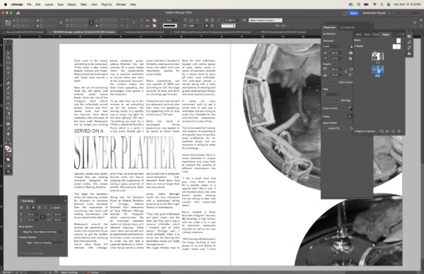
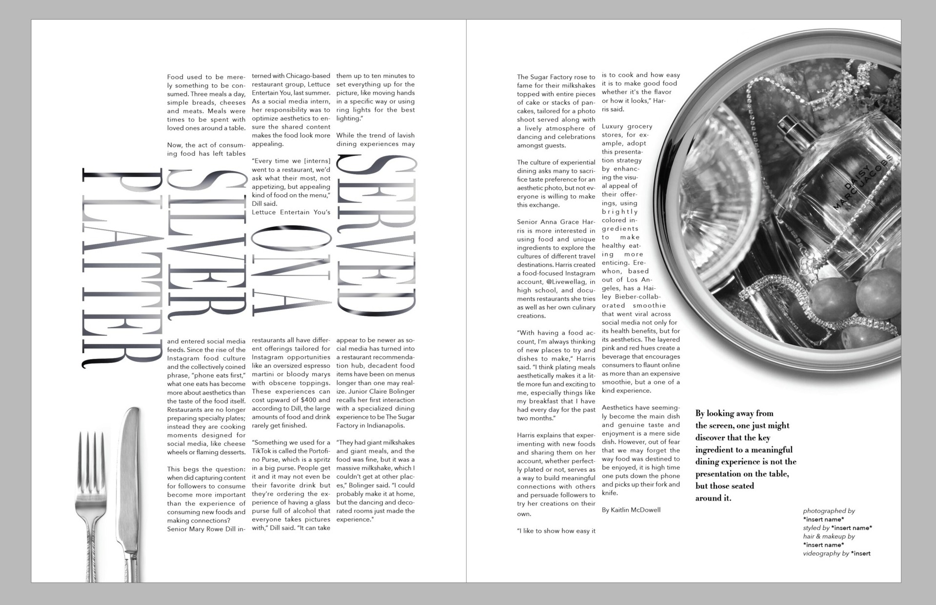
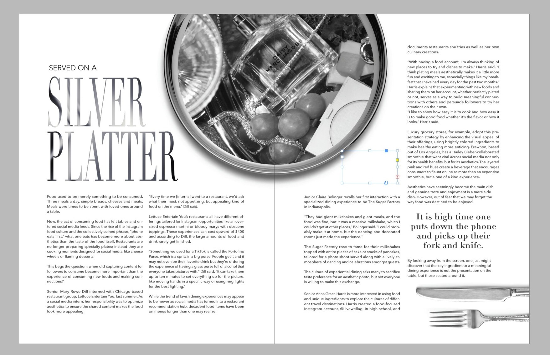
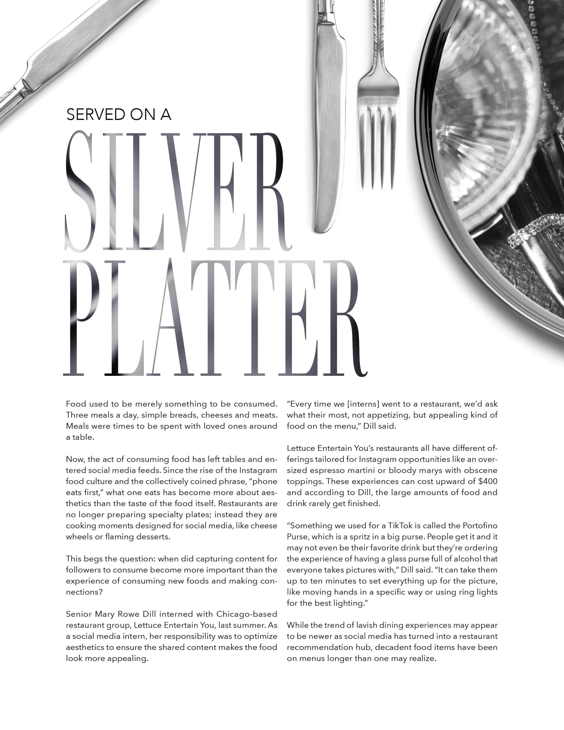
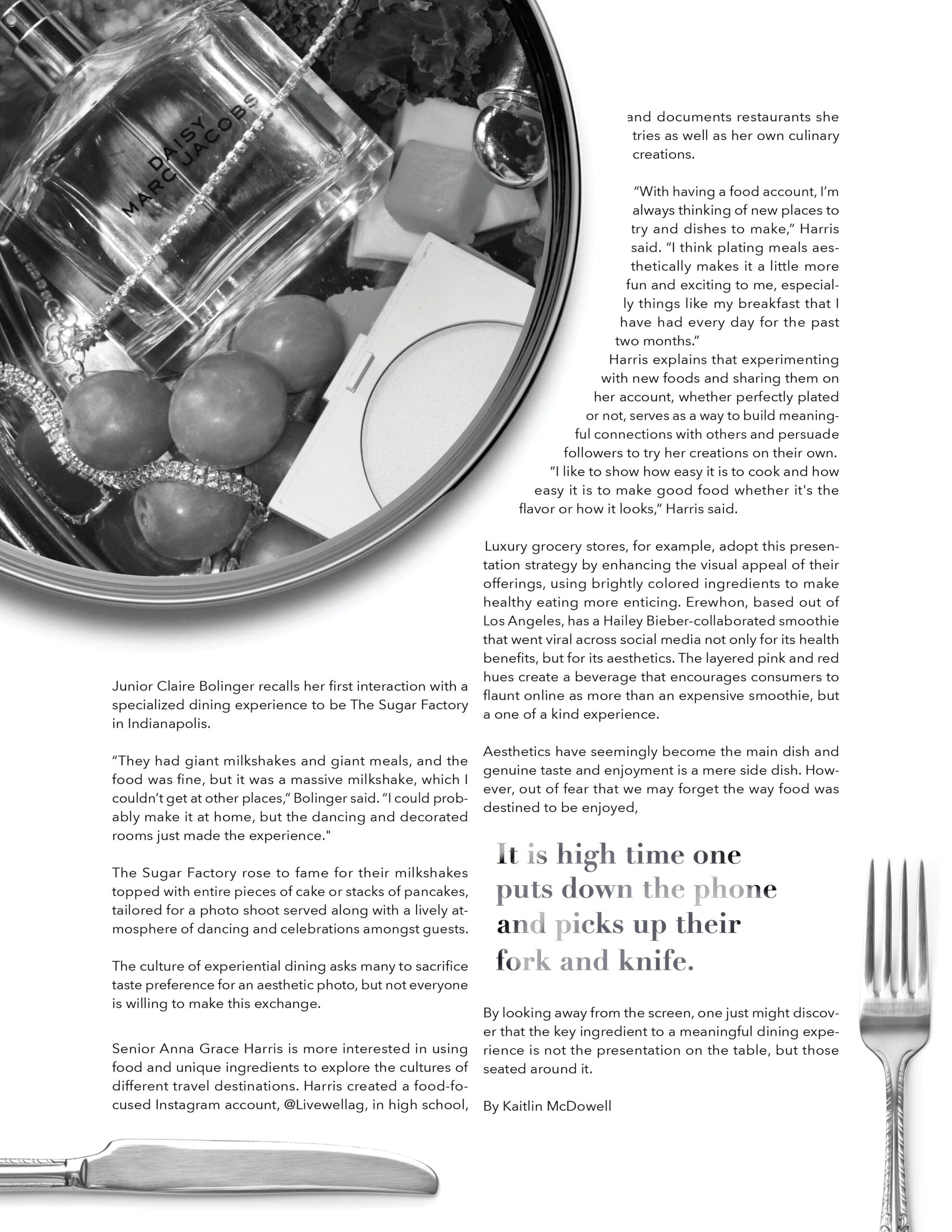
This UP Magazine spread for Miami University’s student-run publication demonstrates my role as a publication layout designer, where I was responsible for the visual organization and structural flow of the piece. While the editorial text and photography were provided, I carefully curated the typography and spatial arrangement to create a cohesive high-end aesthetic. By utilizing a precise grid system, I balanced the bold serif headlines with large-scale imagery, using the placement of cutlery and circular photo crops to lead the reader through the provided content. The layout highlights my ability to take existing assets and transform them into a professional, editorial experience through meticulous attention to alignment, white space, and visual hierarchy.
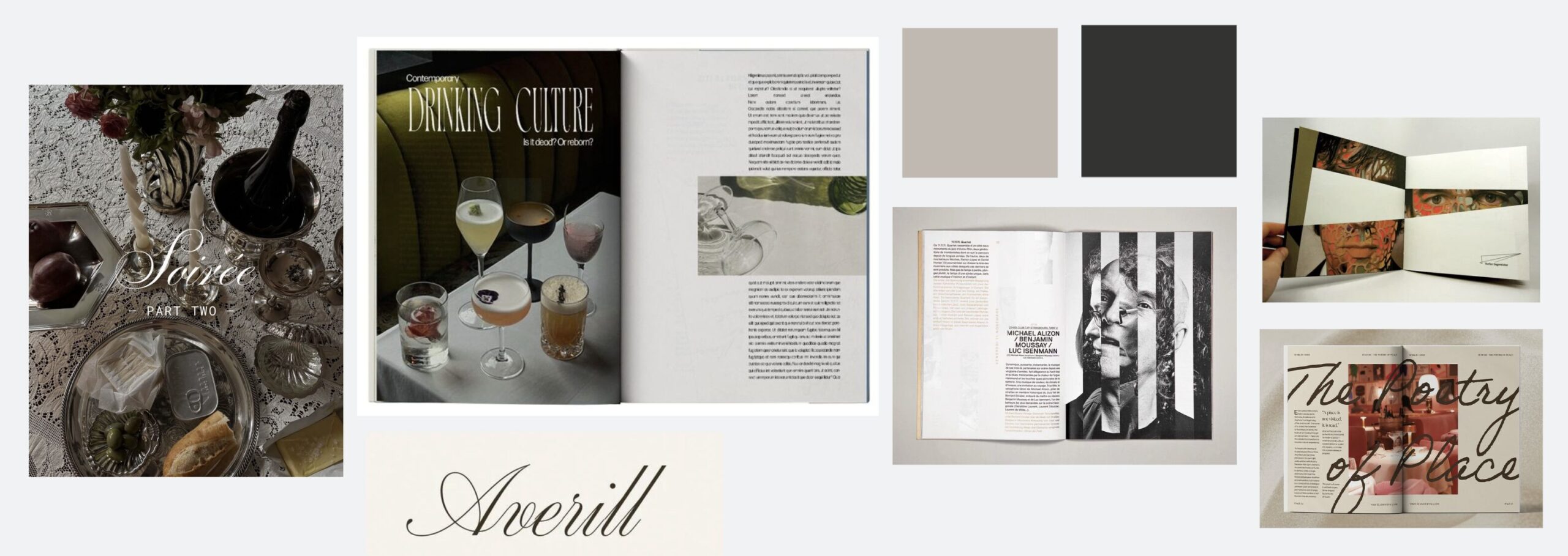
Mood Board
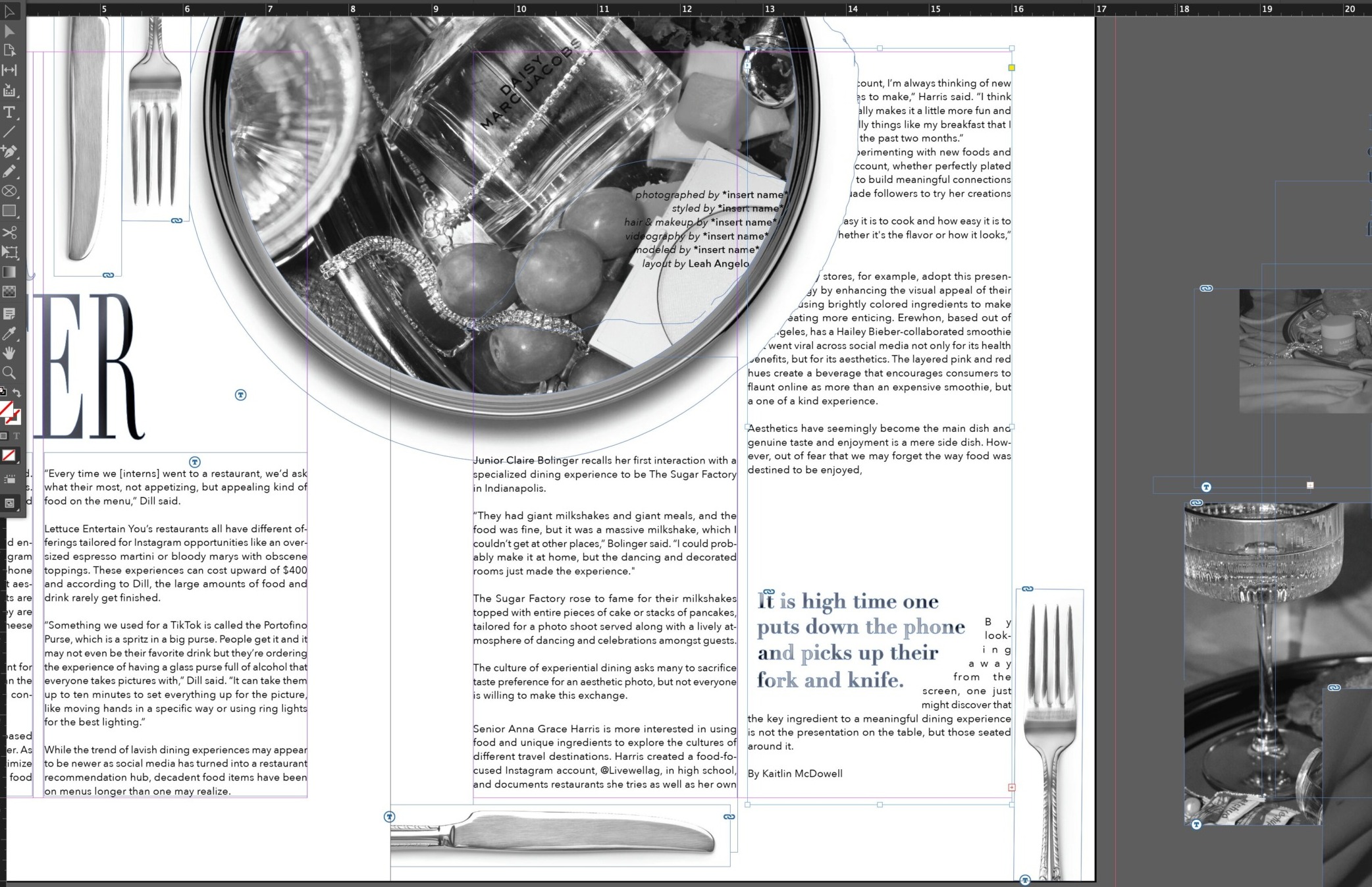
Some work along the way